I recently attended an event in Edinburgh where O2 and HTC were showing off Android mobile phones; the 4.3” HTC Sensation XE, the 4.7” HTC Sensation XL, and the 3.7” HTC Rhyme. I was offered the choice of the three to take home and play with, and I decided to go with the mid-range Rhyme. I’ve been using it a fair bit for the last couple of weeks.
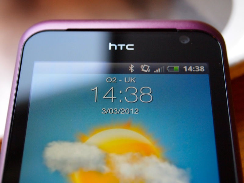
My own experience of Android is limited, so I’m pleased to have the opportunity to try something relatively recent.
Of course, I’ve been primarily using iOS for the last few years, so bear that in mind as I describe my experiences.
Design
The main reason I decided to try the Rhyme is the size. Both of the Sensation phones felt too big for comfortable usage. The Rhyme fits nicely in the hand.
My previous experience with HTC hardware is that it feels solid, and this phone is no exception. The case is plastic, with a band of metal on the back with the HTC logo. HTC class this phone as “Lifestyle: Fashion” on their website, and they’ve definitely tried to make this phone stylish. I quite like the muted purple colour, but your own tastes may vary.
The Rhyme has a 480x800 3.7” display, which is bright, clear and visible at most angles. The touchscreen was responsive most of the time, but does depend on which app is being used, or if you have apps open in the background.
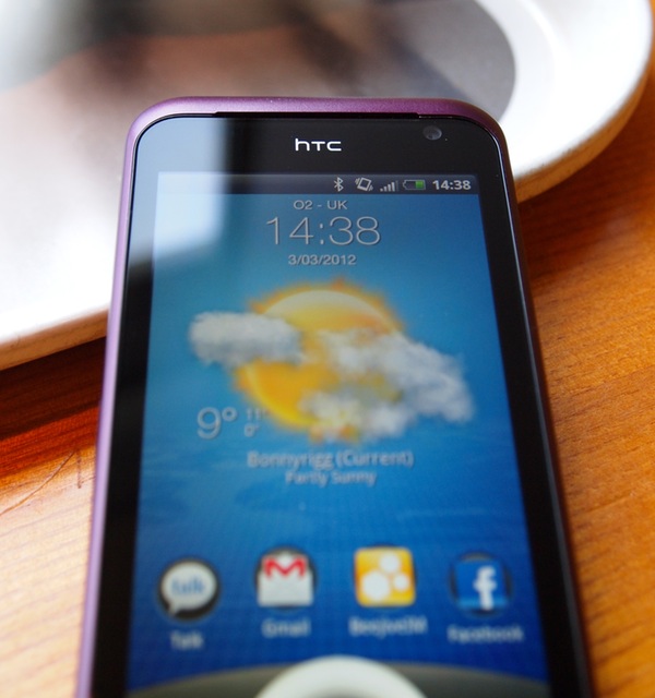
There’s a 3.5” headphone jack and the power button on top, with a volume rocker and a Micro-USB connector on the right side. The cover for this feels a bit flimsy. The phone also has an indicator LED for notifications and charging information.
Battery life is good. I found it easily lasted a whole day of heavy use (Internet, Spotify, Navigation, etc), and lasts a decent amount of time on standby. The battery is non-removable.
There are two cameras, a rear-facing 5 megapixel camera with LED flash, and a front-facing VGA camera for video calls and self-portraits.
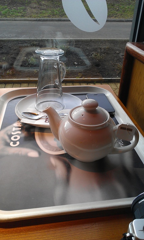 (Sample photo. Click for full size.)
The camera works well, although the camera app was a bit slow to respond sometimes. Taking pictures isn’t instant but is reasonably fast. The LED flash is bright but tends to wash out pictures in my experience. (It does however work at three levels of brightness in the supplied Flashlight app.)
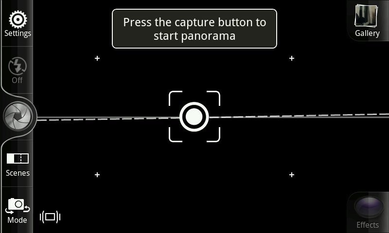
There are several useful modes, including HDR, “Action Burst” which takes multiple pictures quickly then lets you choose which to keep, and a great panorama feature. You are guided through the panorama using the motion sensor to get pictures level and correctly spaced.
You can also shoot reasonable video at up to 720p, with an option for capturing slow motion video.
The phone’s built in speaker is tinny but does work. Just don’t put it on a surface - the speaker is poorly located on the back and is easily muffled.
The phone supports FM Radio when headphones are plugged in. It also has GPS, “G-Sensor” for orientation which I think must be a gyroscope, Bluetooth 3.0 and Wi-Fi Hotspot.
Accessories
There are a lot of accessories in the box, including headphones, “charm”, speaker dock, charging cable and adapter, and a cream coloured carrying case.
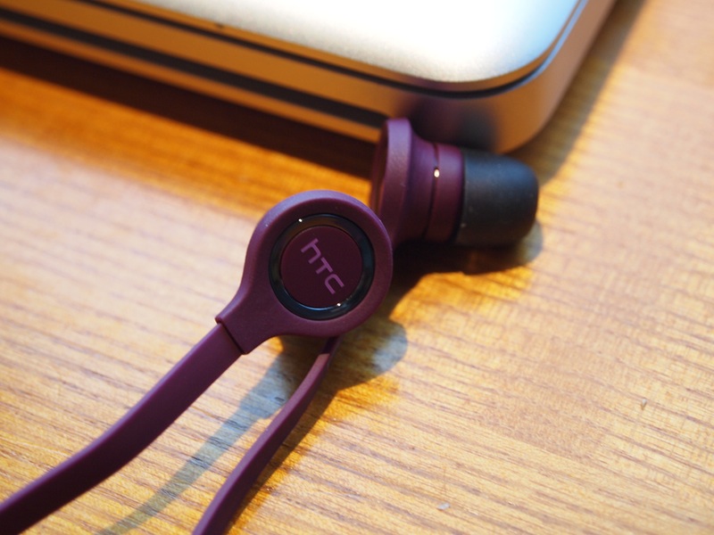
The Rhyme is the only phone of the three on offer that didn’t come with Beats Audio, so instead there are HTC-branded in-ear headphones. They’re pretty good. They come with three different bud sizes, and match the colour of the phone.
Sound is a little bass heavy, but generally good for bundled headphones. I’m not a huge fan of the “tangle-free” cord, and I found the controls were a bit too far down the cord for easy use. However, they are more comfortable than Apple’s standard headphones (for me, your ears may vary).
The phone comes with a “charm”, a light on a cable that attaches to the headphone socket and flashes on incoming calls and messages. Unfortunately, it lacks, er, charm. You can’t use headphones at the same time, and the light isn’t as bright as it could be, so could be missed outdoors in sunshine. Frankly, the charm feels a bit silly with a cord dangling loose.
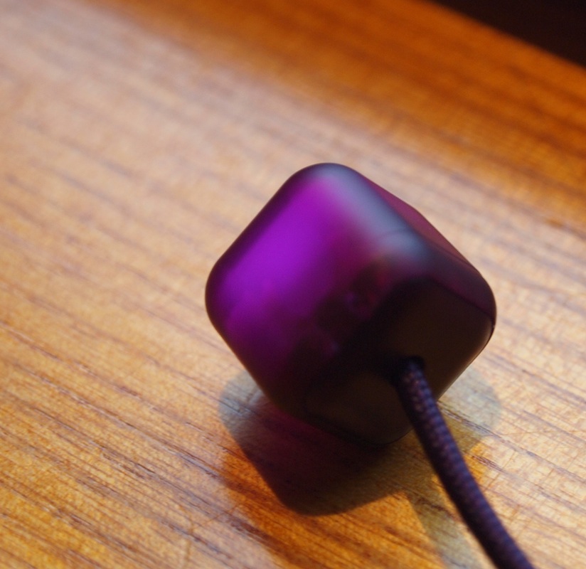
The charm could be improved by losing the cord and by vibrating as well as flashing. A Bluetooth charm with a rechargeable battery would be a lot more useful, especially if it charged on the dock.
Speaking of the dock, it’s good. It has a built-in Bluetooth speaker which is triggered by putting the phone in the dock, which also charges the phone through three metal dots on the back under the camera. This makes it very easy to charge at the end of the day, without plugging it in - just drop into the dock.
Putting the phone in the dock triggers a “Dock Mode” which shows the time, weather, and the built in music player (this does not work with other audio apps). You can also dim the display for use in a dark room. In this mode it’s a little hard to see depending on viewing angle.
Unfortunately the Bluetooth speaker will only work when the phone is docked. The speaker dock is not visible to any other Bluetooth device. It does sound good considering the small speaker and that the audio is streaming via Bluetooth.
The dock mode can be disabled if you prefer to use Spotify, Listen or another audio app. Adjusting audio volume can be awkward like this - the volume rocker is not easily accessible in the dock. While changing the volume in the dock, you should be careful not to jostle the phone - this will interrupt any playing audio.
Software
Another reason I decided to go with the Rhyme is that it’s running the latest version of HTC Sense of the three phones on offer.
The HTC Rhyme currently runs Android 2.3.5 (Gingerbread), as well as HTC’s own Sense software (3.5). It comes with the Google suite of apps, including GMail, Google Maps, Google Search and Google Talk. It also includes several HTC apps, including many widgets and lock screen customisations.
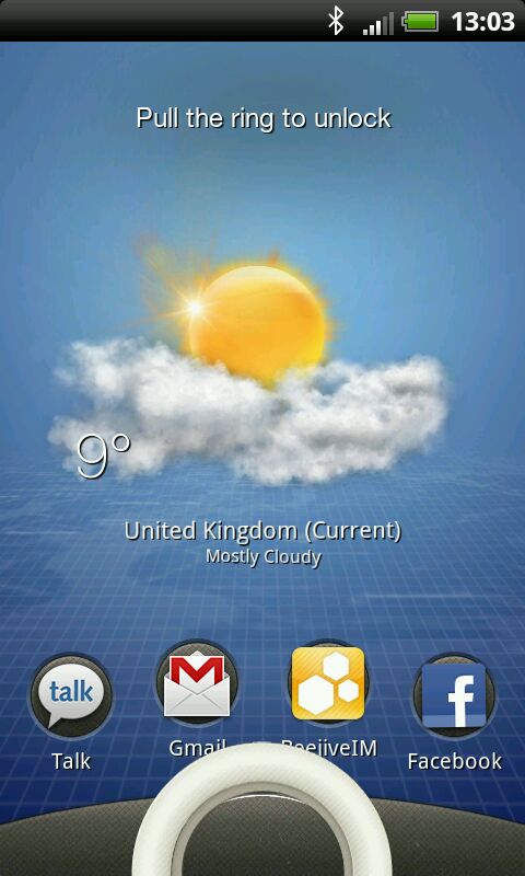
The lock screen can be changed to show social media updates, weather, photos or stock information. You can also assign shortcuts - dragging the “ring” at the bottom of the screen to the centre unlocks the device, and dragging the icons to the ring quickly opens that app, which I really like.
Home Screen
The phone can be customised extensively. You can change much of the appearance and function of the lock screen and home screens.
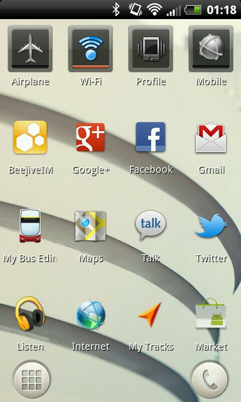
I found the home screen customisation process to be frustrating. You must drag a widget down to the bottom to change settings, but I would end up dragging it down and it would release at the bottom instead. It is also not clear whether you can customise a widget until you start dragging it.
In day-to-day use Sense feels quite heavy. It does make the phone look beautiful in screenshots, but there are nearly 90 HTC supplied widgets, and a lot of them feel cluttered and busy.
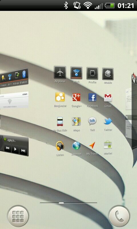
If you swipe quickly between screens, a “Carousel” appears showing all your screens in a spinning, 3D loop, but it is difficult to control. When spinning you can’t see any detail, the screens are small so making out which one to pick is a bit tricky, and precise selection is a hit and miss affair.
I do like that you can have more information available on the home screens than simply icons. Over time I ended up using fewer widgets, and simply pressing the apps button in the bottom left and skipping the home screen entirely.
One exception is the Wi-fi/Airplane Mode/Mobile Data widgets that allow one touch changing of settings for this. These are great.
A tip - choosing “Scene” in the personalise menu will change wallpaper and home screen layout without confirmation. Your settings will be saved as part of the scene you leave behind. I spent time customising my screen then picked another scene, and thought I’d lost all my work.
Browser
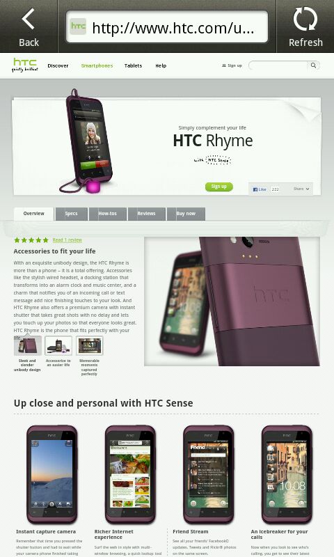 The built-in “Internet” app worked reasonably well, although it reflows the webpage to resize text when you zoom, making it difficult to read the text you want without it getting narrow. I also didn’t discover a shortcut to take you quickly to the top, which I miss from iOS.
I’m not sure if it was software or hardware, but the browser didn’t feel very fluid, and on complex pages often lagged behind on my touches.
Adobe Flash is present, but I quickly changed this to be “on demand” (in Settings/Enable Plugins) as sites with Flash ads slow the browser down heavily. It’s a nice option, but I wouldn’t miss it.
Keyboard
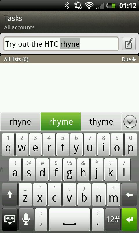 The HTC supplied keyboard is a big improvement over previous Android devices I’ve used and works very well. It also has a swipe mode (a la Swype) that allows you to draw words. I like having word suggestions to choose from, although it does take up a lot of space in landscape. Of course, you have the option to download another keyboard from the Android Market.
There is also the option to use voice input, which is about 90% accurate for my accent.
Behaviour
I found large inconsistencies in app behaviour. Often the back button would lead me to somewhere I wasn’t expecting to go, and the layout of navigation and controls is often wildly different between apps.
I also found that some system apps used the menu button, and some did not. For example, in the Gallery app, pressing the menu button does nothing, but tapping the screen gives you an on-screen menu with options.
Many apps ape an iOS style layout, which is a poor choice on the part of developers. App design should be placed in context, i.e. using Android UI elements and design language.
Scrolling behaviour is different in almost every app I tried. Google’s apps do it one way (scroll to top, hit a brick wall), HTC’s apps another (small amounts of momentum when at top and bottom), and third party apps differ considerably. I did not find a single app that matched iOS for scrolling responsiveness.
These inconsistencies were enough to make using the phone very frustrating. You can certainly do anything with this phone that you can with an iOS device, but it might take you a bit longer to get there.
Final Thoughts
O2 have just dropped the price of the Rhyme to free on an 18 month contract, or £329.99 on Pay & Go. For the price, it feels well built and looks good, assuming you like purple.
I am the first to admit I am not a typical user of this device, but I found the small (and large!) software inconsistencies in Android and Sense made it very difficult to get comfortable. Maybe if you were already used to Android, you’d have an easier time.
Thanks to O2 and HTC for letting me try the HTC Rhyme. I’m looking forward to seeing the HTC One running a lighter Sense and Ice Cream Sandwich - I hope that many of my issues will be resolved.